Packaging Design - Cookmatic

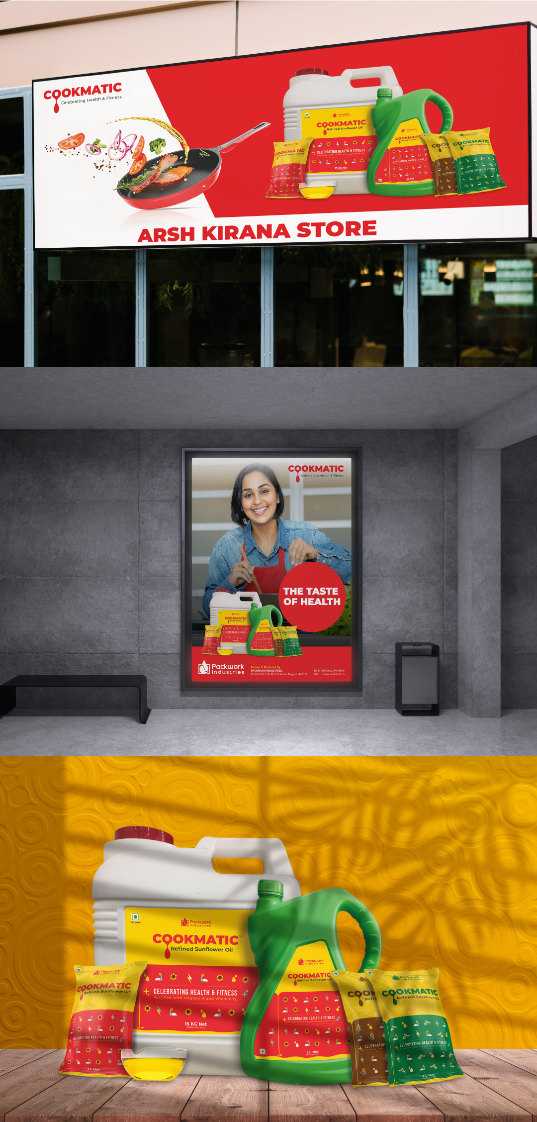
Project Overview: Nutshell Ideas worked with Cookmatic, a cooking oil brand, to make their packaging look great in an affordable manner. Design Concept: Cookmatic's packaging design is special because it shows that their oil is great and it doesn't cost a lot to make. Here's how we did it: Reflecting Product Value: We wanted the design to tell people that Cookmatic makes really good cooking oil. So, we kept the design simple and nice. This makes people think that Cookmatic's oil is pure and high-quality. Cost-Efficient Two-Color Scheme: We used only two colors to save money on printing. This was not only good for the budget but also good for the environment. It shows that Cookmatic cares about the planet. The Power of Color: We used one color that stays the same for all Cookmatic oils. This makes Cookmatic look reliable and trustworthy. The other color changes to show what kind of oil it is. For example, green means olive oil, and amber means vegetable oil. This helps people quickly find the oil they want in the store. Conclusion: Nutshell Ideas is proud to have worked with Cookmatic to make their packaging look great in an affordable way and help people choose the right oil. Cookmatic's two-color idea shows our commitment to making good-looking and practical designs, and we're happy to show it off in our portfolio.
  • Client: Cookmatic
  • Category: Packaging